Scene Description Spotlight: “Memento”
With the movie Memento (2000), Christopher Nolan had a challenge when writing the script: How to make clear to the reader — and the…

With the movie Memento (2000), Christopher Nolan had a challenge when writing the script: How to make clear to the reader — and the production crew — when the narrative was moving forward … and when it was backward.
Here is the beginning of the screenplay. Can you see what stylistic choices Nolan made to accomplish his goal?
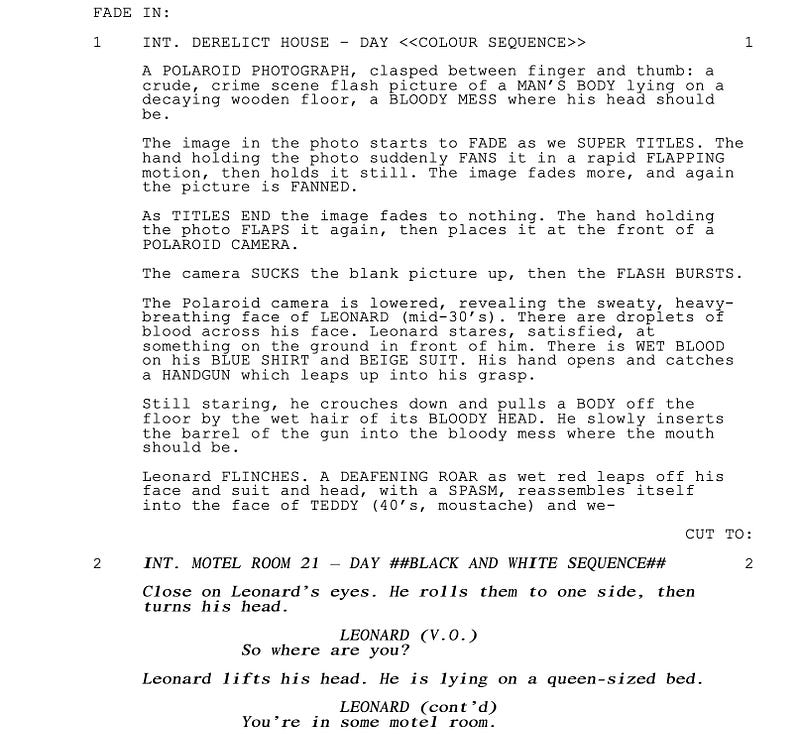
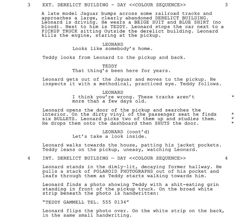

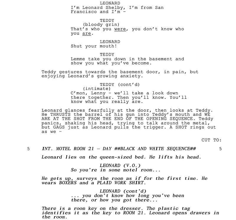
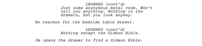
For the movie, Nolan uses black-and-white footage to signify sequences that run in forward chronological order, and color footage for sequences that run in reverse chronological order, both color schemes specified in the script. But that’s for the movie. What about for the cast and crew reading the script? How to tip them off?
What Nolan did was use regular typeface for the reverse chronological sequences and italics to signify forward chronological sequences.
In fact, in the copy of the script I have, Nolan also bolded the forward sequences to further make clear the respective time frames.
That is a simple tip you can use for ‘special’ scenes or sequences. For example, you can italicize flashbacks to underscore their significance to a reader. Same thing with dream or fantasy sequences.
It’s an interesting way to handle scene description.
For more Scene Description Spotlight articles, go here.